
Welcome to the fourth part of this tutorial series on “Android design support library”. To read overview of the series, refer to the serious announcement blog post.
A quick glimpse of all parts:
- Part 1, we talked about Floating action button
- Part 2 is about Snackbar
- Part 3 is about Styling snackbar where we saw how to display different coloured Snackbar
In this part – NavigationView
At the time announcing material design, we didn’t have all the tools and components, rather we were dependent on the third-party libraries and tools, but with the release of android design support library, it becomes easier to implement Navigation drawer in our android applications, if you have implemented navigation drawer earlier then you would know how it was cumbersome task!
In short, Navigation view makes it far easier to create a navigation drawer then the previously documented example.
In this part, I will directly talk about NavigationView, which is another important and awesome component provided in android design support library.
How Navigation view works?
If you remember, earlier we were dependent on either ListView or LinearLayout, were defining a custom adapter for displaying Navigation drawer as per the need, but with this NavigationView, we just need to include in inside the same DrawerLayout, so point is earlier we were including ListView inside DrawerLayout and now we will include NavigationView inside DrawerLayout.
Two important parameters
Below are the two important parameters required to set up NavigationView, same as the navigation drawer in Inbox and Google play store applications.
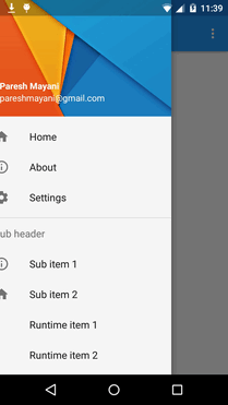
app:menu– list of navigation drawer items, here we will just need to create a normal menu file for the required items.app:headerLayout– which is header layout, like we display background image and profile picture with name and other details.
    <android.support.design.widget.NavigationView
        android:id="@+id/navigation_view"
        android:layout_height="match_parent"
        android:layout_width="wrap_content"
        android:layout_gravity="start"
        android:fitsSystemWindows="true"
        app:headerLayout="@layout/drawer_header"
        app:menu="@menu/drawer_view"/>
There are 2 ways to implement a navigation drawer, we will see both the ways.
- Design time, by preparing menu file with the items
- Run time, by adding items into the Navigation view programatically
Now, let’s get started!
[alert style=”green”]1. Design time[/alert]Step 1: Create a menu for navigation drawer items
It’s same as creating a menu xml file (drawer_view.xml), just create a menu file under menu folder.
<menu xmlns:android="http://schemas.android.com/apk/res/android">

    <group android:checkableBehavior="single">
        <item
            android:id="@+id/nav_home"
            android:icon="@drawable/ic_drawer_home"
            android:title="@string/nav_home" />
        <item
            android:id="@+id/nav_about"
            android:icon="@drawable/ic_drawer_about"
            android:title="@string/nav_about" />
        <item
            android:id="@+id/nav_settings"
            android:icon="@drawable/ic_drawer_settings"
            android:title="@string/nav_settings" />

        <item
            android:id="@+id/navigation_subheader"
            android:title="@string/nav_sub_header">
            <menu>
                <item
                    android:id="@+id/navigation_sub_item_1"
                    android:icon="@drawable/ic_drawer_about"
                    android:title="@string/nav_sub_item_1" />
                <item
                    android:id="@+id/navigation_sub_item_2"
                    android:icon="@drawable/ic_drawer_home"
                    android:title="@string/nav_sub_item_2" />
            </menu>
        </item>
    </group>
</menu>
Checkable menu items
You can define the checkable behaviour for individual menu items using the android:checkable attribute in the android:checkableBehavior attribute in the
The android:checkableBehavior attribute accepts either:
single– Only one item from the group can be checked (radio buttons)all– All items can be checked (checkboxes)none– No items are checkable
Step 2: Create a header layout
Create a header layout (drawer_header.xml) in layout folder, include whatever views you want in header of navigation drawer.
<?xml version="1.0" encoding="utf-8"?>
<LinearLayout xmlns:android="http://schemas.android.com/apk/res/android"
    android:layout_width="match_parent"
    android:layout_height="192dp"
    android:background="?attr/colorPrimaryDark"
    android:padding="16dp"
    android:theme="@style/ThemeOverlay.AppCompat.Dark"
    android:orientation="vertical"
    android:gravity="bottom">

    <TextView
        android:layout_width="match_parent"
        android:layout_height="wrap_content"
        android:text="Username"
        android:textAppearance="@style/TextAppearance.AppCompat.Body1"/>
</LinearLayout>
Step 3: Get NavigationView and include menu and header layout
Open activity_main.xml layout file and include NavigationView with including menu and header layout attributes.
<?xml version="1.0" encoding="utf-8"?>
<android.support.v4.widget.DrawerLayout xmlns:android="http://schemas.android.com/apk/res/android"
    xmlns:app="http://schemas.android.com/apk/res-auto"
    android:id="@+id/drawer_layout"
    android:layout_height="match_parent"
    android:layout_width="match_parent"
    android:fitsSystemWindows="true">

    <!-- Your content layout goes here -->

    <android.support.design.widget.NavigationView
        android:id="@+id/nav_view"
        android:layout_height="match_parent"
        android:layout_width="wrap_content"
        android:layout_gravity="start"
        android:fitsSystemWindows="true"
        app:headerLayout="@layout/nav_drawer_header"
        app:menu="@menu/nav_drawer_view"/>

</android.support.v4.widget.DrawerLayout>
Step 4: Initialize Navigation view in activity class
private NavigationView mNavigationView;
mNavigationView = (NavigationView) findViewById(R.id.navigation_view);
Step 5: Assign navigation drawer item selected listener
//setting up selected item listener
navigationView.setNavigationItemSelectedListener(
       new NavigationView.OnNavigationItemSelectedListener() {
              @Override
              public boolean onNavigationItemSelected(MenuItem menuItem) {
                        menuItem.setChecked(true);
                        mDrawerLayout.closeDrawers();
                        return true;
              }
       });
[alert style=”green”]2. Creating Navigation view programmatically[/alert]
There could be a scenario where you need to prepare a navigation view by adding items programmatically. We are adding items programmatically in our Google Developers Group android application, it’s yet to roll out the new version with design support library integration!
To add the item programatically, we can get a Menu object using getMenu() method of NavigationView and then we can add items into the navigation drawer using that Menu object.
final Menu menu = navigationView.getMenu();
for (int i = 1; i <= 3; i++) {
    menu.add("Runtime item "+ i);
}
Using SubMenu, we can add a subsection and items into it.
// adding a section and items into it
final SubMenu subMenu = menu.addSubMenu("SubMenu Title");
for (int i = 1; i <= 2; i++) {
    subMenu.add("SubMenu Item " + i);
}
As we have added items into the navigation drawer adapter, refresh the adapter using below code:
        for (int i = 0, count = mNavigationView.getChildCount(); i < count; i++) {
            final View child = mNavigationView.getChildAt(i);
            if (child != null && child instanceof ListView) {
                final ListView menuView = (ListView) child;
                final HeaderViewListAdapter adapter = (HeaderViewListAdapter) menuView.getAdapter();
                final BaseAdapter wrapped = (BaseAdapter) adapter.getWrappedAdapter();
                wrapped.notifyDataSetChanged();
            }
        }
Other Points:
- If you want to listen to the navigation drawer open and close event then you can take our older
ActionBarDrawerTogglebut of V7 support library. - You should replace older action bar with Toolbar
        Toolbar toolbar = (Toolbar) findViewById(R.id.toolbar);
        setSupportActionBar(toolbar);

        final ActionBar ab = getSupportActionBar();
        ab.setHomeAsUpIndicator(R.drawable.ic_menu);
        ab.setDisplayHomeAsUpEnabled(true);
And use No action bar theme.
<style name="AppTheme" parent="Base.Theme.DesignDemo"> </style> <style name="Base.Theme.DesignDemo" parent="Theme.AppCompat.Light.NoActionBar"> <item name="colorPrimary">#2196F3</item> <item name="colorPrimaryDark">#1976D2</item> <item name="colorAccent">#E040FB</item> <item name="android:windowBackground">@color/window_background</item> </style> - Handle menu icon click event
@Override public boolean onOptionsItemSelected(MenuItem item) { int id = item.getItemId(); switch (id) { case android.R.id.home: mDrawerLayout.openDrawer(GravityCompat.START); return true; case R.id.action_settings: return true; } return super.onOptionsItemSelected(item); } - Handle back key press event, standard is to close the navigation drawer if it is open.
   @Override
    public void onBackPressed() {
        if (isNavDrawerOpen()) {
            closeNavDrawer();
        } else {
            super.onBackPressed();
        }
    }

    protected boolean isNavDrawerOpen() {
        return mDrawerLayout != null && mDrawerLayout.isDrawerOpen(GravityCompat.START);
    }

    protected void closeNavDrawer() {
        if (mDrawerLayout != null) {
            mDrawerLayout.closeDrawer(GravityCompat.START);
        }
    }
Open issue
- As we discussed above, we include
android:checkableBehavior="single"to mark a single item checked at a time, but it is not working for the sub section items. Yes, currently it’s only working for the first group menu items
Download source code
You can download a complete example from the design support library examples repository, bookmark this repository! I would be adding more examples and a complete demo (demo of all the design support library components) into this repository!
Wrapping up
This bring us to the end of this part. In this part, we have seen how we can prepare a NavigationView design time and adding sub-section. We have also seen adding items into the navigation view programmatically. As said if you want to listen to the navigation drawer open and close event then you can include ActionBarDrawerToggle too!
So far we have talked about Snackbar, Floating action button and NavigationView, total three awesome components of android design support library. In further parts, we will talk about CoordinatorLayout and behaviors, Floating label edit text, Tab layout, App bar layout and an amazing collapsing toolbar. See you in next part!


