

Mobile shoppers browse quickly and lose patience fast. Every extra visual element or layout delay slows them down. To drive sales, your mobile store must deliver seamless clarity and frictionless checkout.
In this article, let’s explore the psychology of mobile impulse buying, optimizing for mobile display, speeding up navigation and checkout, and why you need to test the site regularly.
The Psychology of Mobile Impulse Buying
Mobile shoppers operate under strict cognitive constraints. Their attention spans are brief while navigating small touch screens, making them expect instant visual feedback and frictionless navigation paths.
Unclear controls, excessive input, and unnecessary navigation increase both interaction and cognitive costs. When images load slowly, customer frustration sets in fast, just as unclear pricing displays quickly drive potential buyers away.
Understanding user behavior helps you build better layouts. Because shoppers want clear choices, you need to reduce visual noise. Designing specifically for speed is what transforms casual browsing into actual sales.
Understanding Micro-Moments in Shopping
Buyers make purchase decisions in brief moments. They check products while standing in line or scan deals during short work breaks.
Your layout should serve these quick interactions by keeping essential details above the fold line. The product title, price, primary value proposition, and next action should all be seen quickly, as delaying crucial product details ruins conversion chances fast.
Reducing Cognitive Load on Small Screens
Your website should display only necessary information during initial page loads, while secondary details can be hidden inside clean, collapsible accordion panels. A simple visual hierarchy helps visitors process items effortlessly.
Optimizing the Visual Viewport Above the Fold
The top section determines immediate user engagement levels because visitors form early impressions within the first few moments. It is necessary to make this critical viewing space work effectively.
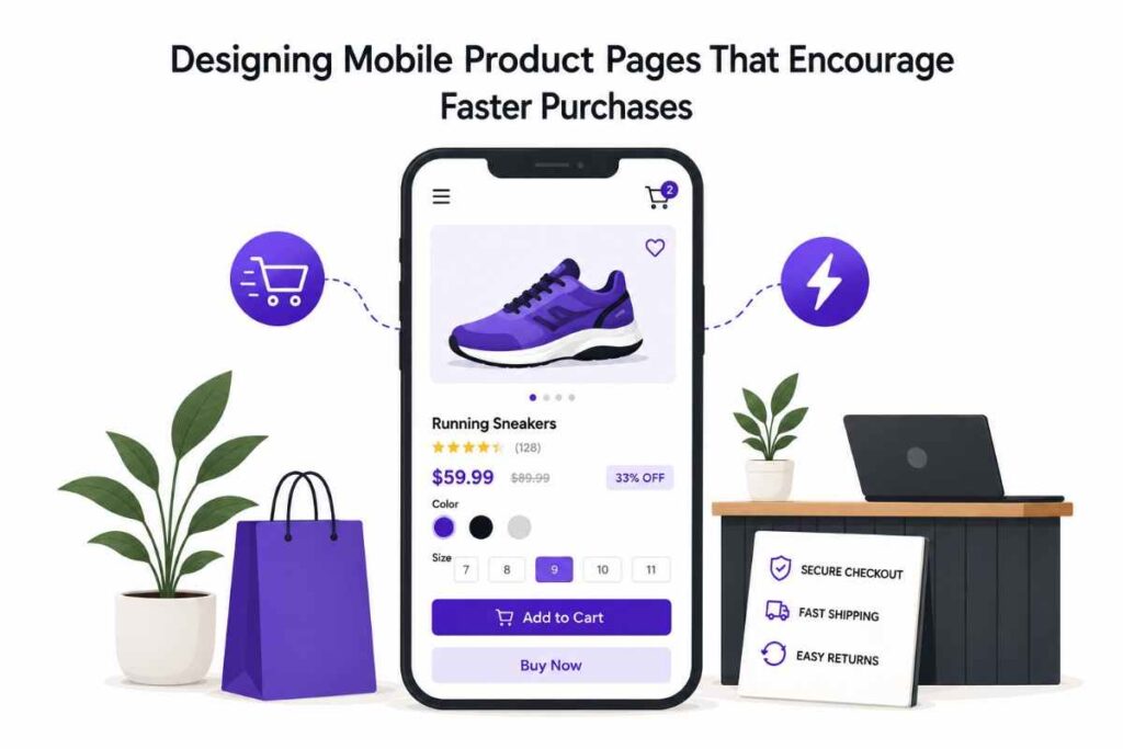
Here, you should focus on high-impact visual components. Display the core item title very clearly and feature high-resolution product photography at the top center. Place pricing details right next to photos, and position the main call-to-action button prominently without surrounding the product header with unnecessary promotional banners.
High-Impact Product Image Carousels
Product images sell physical products faster than text explanations. Because of this, your mobile galleries must support smooth horizontal touch gestures, ensuring that image swipe animations feel fast and natural.
Store owners should include visible pagination dots under image slides and let users tap thumbnails to switch images easily. Enabling pinch-zoom functionality for close material inspection lets users observe details comfortably.
Furthermore, you need to optimize image file sizes without sacrificing picture quality. Compressed images load faster over spotty mobile networks, preventing users from abandoning pages out of impatience.
Structuring Clear Product Titles and Pricing
Product titles must remain concise on small displays, so avoid long descriptive names that wrap across four lines. Stating essential item details in minimal words keeps the layout clean.
Sale prices can be highlighted using high-contrast text styling. If you’re offering a discount, show original prices with a subtle strikethrough line and display percentage discount badges right near the primary price.
Clear price displays reduce buyer doubt instantly. Since unexpected fees are a main driver behind cart abandonment, estimated shipping costs should be shown right near the main pricing.
Streamlining Navigation and Product Selection
Selecting variations should never confuse online shoppers, yet complex drop-down menus frequently frustrate mobile users. Streamlining these options is essential to increase successful purchase completions.
Replace generic text lists with visible color swatches, as interactive visual buttons work better than standard drop-downs in most cases. Ensure tap target sizing feels comfortable for thumbs, and show clear, real-time updates when selections change by immediately displaying matching image variants and updated inventory availability indicators.
Designing Intuitive Variant Selectors
Drop-down menus hide available choices from direct view, forcing users to tap multiple times just to see options. Displaying visible button grids solves this interaction problem cleanly.
Cross out sold-out options using clear visual cues to prevent users from selecting unavailable product combinations entirely. This saves shoppers time by guiding them straight toward available stock.
Keep selector buttons large enough for accurate tapping, aiming for minimum touch targets of 44–48 pixels tall. Proper spacing prevents accidental taps on the wrong selections.
Implementing Sticky Call-to-Action Elements
As visitors scroll down the page, buy buttons often disappear from view. Forcing users to scroll back up breaks their buying momentum, but floating call-to-action bars keep purchasing options visible at all times.
Anchor sticky buttons cleanly to the bottom of the screen, including price displays directly inside this floating bar while ensuring it stays above mobile browser menus.
Make sure sticky elements do not obscure main text, and use slight drop shadows for strong background separation. Be sure to test floating bars across various phone screen sizes to guarantee proper fit.
Speeding Up the Checkout Pathway
Eliminating unnecessary steps reduces checkout drop-off rates significantly. Traditional multi-step checkout processes exhaust busy mobile users, who often prefer direct checkout options that remove extra steps.
Store owners can add a quick buy button to WooCommerce products to streamline purchasing. Shortcut buttons lower user drop-off during mobile browsing, turning casual interest into completed transactions fast.
Eliminating Redundant Cart Steps
Viewing a cart page adds friction for single-item buyers who already know what they selected. Bypassing intermediate confirmation pages keeps momentum high.
Trigger slide-out mini carts for immediate purchase review, confirming item additions without full page reloads. Users can then proceed directly to checkout right from the pop-out menu.
Enhancing Trust and Social Proof on Mobile
Mobile buyers need reassurance before making purchases, especially since security concerns feel heightened on unfamiliar sites. Strategic trust signals build user confidence very quickly.
Displaying Digestible Customer Reviews
Long blocks of text look daunting on phones, so format customer reviews into concise, readable content blocks. Including visual customer photos alongside verified purchase tags adds credibility.
Provide helpful review summaries in the top section, showing average ratings broken down across key product attributes. Allowing buyers to filter reviews by size or color helps resolve lingering product hesitation fast.
Highlighting Urgency and Scarcity Cues
Creating subtle urgency encourages faster buying decisions. Display stock levels when inventory numbers run low, as messages like “Only 3 left” spur immediate action.
Add shipping countdown timers for fast order dispatch, as showing order deadlines encourages prompt checkout completions. However, make sure urgency messaging remains completely honest. Fake countdown timers break long-term user trust quickly, whereas authentic scarcity signals motivate shoppers ethically.
Optimizing Mobile Technical Performance
Design quality matters little if page loading fails, as slow-loading pages destroy conversion metrics instantly. Mobile performance optimization requires true technical layout discipline.
Minimize asset sizes using modern image formatting, implement lazy loading for media elements below the fold, and prioritize critical rendering path scripts. Smoother site interaction keeps shoppers engaged longer overall.
For WordPress stores, implementing WooCommerce quick buy functionality reduces purchasing steps, allowing customers to complete transactions much faster.
Optimizing Touch Targets and Typography
Typography choices impact readability heavily on small displays, so maintain clear font sizing across all content elements. Use a comfortable base font size around 16px and test readability across devices.
Sufficient contrast ratios between text and background prevent visual strain and yield top readability. Avoid ultra-light font weights on mobile screen layouts.
Space interactive buttons apart to prevent misclicks easily. Tappable zones require generous surrounding padding margins, making site navigation feel completely effortless.
Continuous Testing and Data-Driven Optimization
Creating high-converting mobile pages requires continuous experimentation. User behavior changes alongside evolving web technology trends, and regular analytics reviews reveal underlying layout friction points.
Conduct A/B testing on primary call-to-action designs, testing different button colors and action text variations to measure conversion impacts across varying mobile screens.
Key Metrics to Monitor for Mobile Success
Monitor mobile page conversion rates against desktop metrics, and track average time spent on product pages carefully. Also, watch cart add rates closely to gauge real purchase intent.
Analyze bounce rates on key landing page entry points. High bounce rates indicate slow loading or bad layout, so fix performance bottlenecks immediately to retain user traffic.
Furthermore, track checkout completion rates across different payment options. Identifying drop-off points highlights lingering user friction, leading to sustainable revenue growth online.
Conclusion
Designing mobile product pages demands extreme clarity and speed. Streamlined layouts remove visual barriers for casual shoppers, while fast-loading images and simple menus build momentum.
Focusing on mobile ergonomics can transform overall conversion rates. Express payment options eliminate tedious checkout friction completely, turning browsing traffic into actual revenue.
Prioritize user needs across every visual layout choice. Keep shopping pathways direct, intuitive, and lightning-fast. Optimized mobile product pages drive faster buyer decisions daily.